-
Charts can turn your numbers into visuals, providing insights at a glance. Excel offers a variety of chart types, and knowing how to create, modify, and format them will elevate your data presentation skills.
Let’s break this down step-by-step.
Creating a chart is like painting a picture with your data—let’s bring it to life!
Steps to Create a Chart
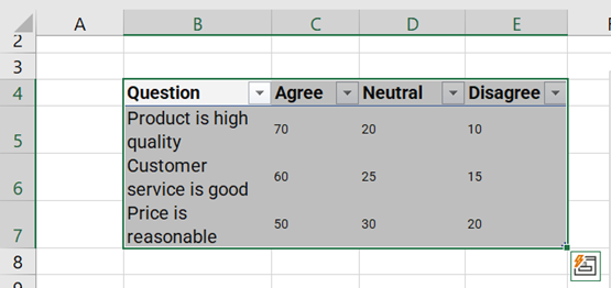
1. Select your Data:
Highlight the range of cells that contains the data you want to visualise. Make sure to include any headers, as they will become the labels in your chart.
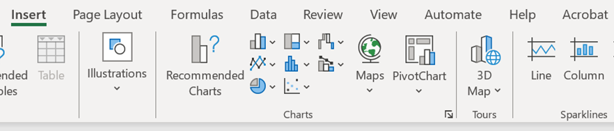
2. Insert a Chart:
- Click on the Insert tab in the Ribbon.
- In the Charts group, you’ll find various chart types. Choose from Column, Line, Pie, Bar, and more!
- Click on the desired chart type and select a specific style from the dropdown menu.
3. Your Chart Appears:
Excel will create a chart and place it on your worksheet. You can move it around by clicking and dragging.


See Also: Excel Quick and Simple Charts
You can also watch the video below for more detail on how to create the chart you need – including the relevant keyboard shortcut to make things even quicker!
Congratulations! You’ve just created your first chart. Now, let’s explore how to modify it to fit your needs…
